Why Responsive Website Design Actually Matters for Your Business
-

- June 25th, 2026
- 21 views

FREE SEO Topical Map Generator: Find Your Next Content Ideas
Okay, let me ask you something real quick. When was the last time you pulled out your phone to look something up? Maybe a restaurant, a local service, or just to check out a business before calling them?
Yeah everyone does it. Every single day. So here's the thing. If someone searches for your business on their phone and your website looks like a mess — text too small to read, buttons impossible to tap, images all over the place they're closing that tab immediately. No second chances.
That's exactly why responsive website design is not just a "nice to have" anymore. It's the foundation of any serious business website.
So What Does Responsive Actually Mean?
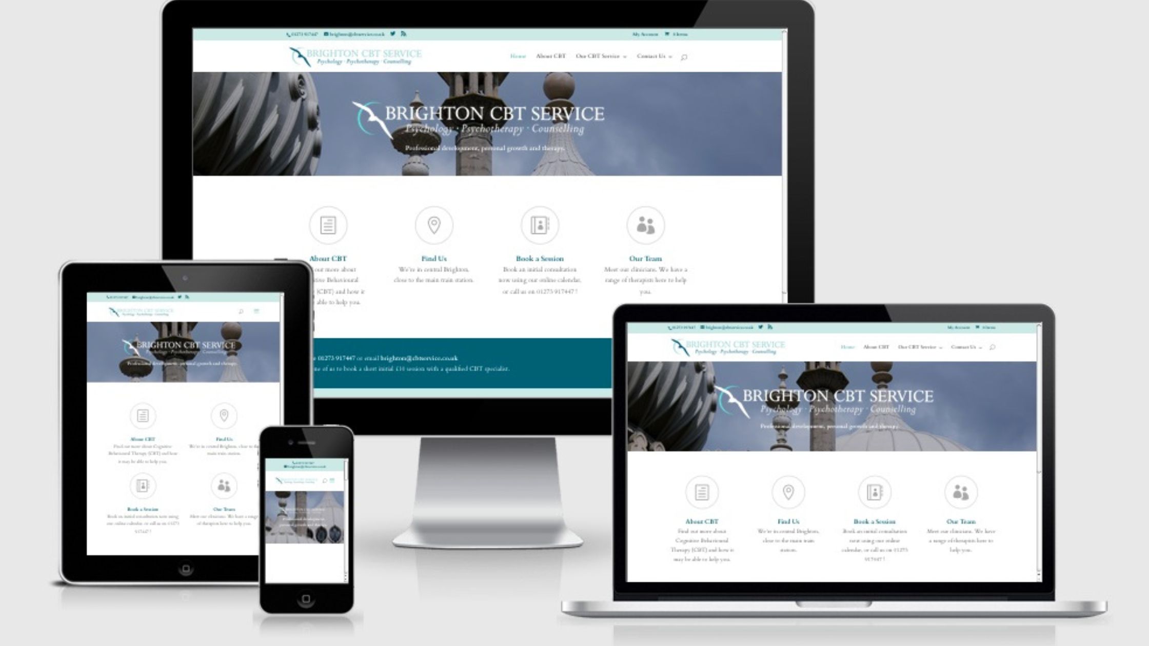
Simply put, a responsive website automatically adjusts its layout depending on the screen it's being viewed on. Whether someone visits your site on a desktop, a laptop, a tablet, or a smartphone everything looks clean, loads properly, and works the way it should.
No pinching. No zooming. No frustration.
It's like having a website that just… gets it. It knows where it's being viewed and adjusts accordingly. Smart, right?
Why Google Loves Responsive Websites
Here's something most business owners don't realize until it's too late Google actually ranks responsive websites higher in search results.
Think about it. Google's job is to give people the best possible experience. If your website is hard to use on mobile, Google sees that as a bad experience and pushes your site further down the results page.
On the flip side, a fast, mobile-friendly, responsive website tells Google "hey, this site is worth showing people." And that means more visibility, more clicks, and more customers finding you before they find your competition.
Real Talk — What Happens Without a Responsive Website?
Let's be honest about what a non-responsive website is actually costing you.
People land on your page, struggle to read anything, and leave within 3 seconds. That's called a bounce. Too many bounces and Google quietly starts ranking you lower. Fewer rankings mean fewer visitors. Fewer visitors mean fewer leads. And fewer leads mean less revenue.
It's a quiet problem. You don't always notice it happening. But it's happening.
What a Good Responsive Website Does for You
A properly built responsive website does a few very important things for your business:
It makes a great first impression because your site looks sharp on every device, visitors immediately see you as professional and trustworthy.
It keeps people on your site longer because the experience is smooth, they actually browse around instead of bouncing off immediately.
It helps you rank on Google because search engines reward mobile-friendly, fast-loading websites with better visibility.
It converts visitors into customers because when everything works properly, people are far more likely to call you, fill out a form, or make a purchase.
Who Builds Responsive Websites in Grande Prairie?
If you're a business owner in Grande Prairie or anywhere in Alberta and your current website isn't responsive or you don't even have a website yet this is the right time to fix that.
At Code Kraft, we build responsive websites specifically for local businesses. Every site we create works beautifully on mobile, loads fast, and is set up to rank on Google from day one.
We're not about flashy designs that look good in a portfolio but don't actually bring in business. We build websites that work simple as that.
Final Thought
Your website is running 24 hours a day, 7 days a week, whether you're working or not. It's talking to potential customers while you sleep. The question is what is it saying? If it's slow, broken on mobile, or just plain outdated, it's quietly turning people away every single day.
A responsive website fixes that. And it's honestly one of the best investments you can make for your business right now.
If your website doesn't work properly on a phone, you're losing customers every single day and you might not even know it. That's the reality for a lot of businesses right now.
Responsive website design simply means your website automatically adjusts to look great and work perfectly on any device desktop, tablet, or smartphone. No broken layouts. No tiny text. No frustrated visitors clicking away.
It's not just about looks either. Google actually ranks responsive, mobile-friendly websites higher in search results. So if your site isn't responsive, you're not just losing visitors you're losing visibility too.
A well-built responsive website builds trust, keeps people on your site longer, and most importantly, turns those visitors into real paying customers. At Code Kraft, we build responsive websites for businesses in Grande Prairie and across Alberta. Every site we create is mobile-friendly, fast-loading, and optimized for local search from day one. No cookie-cutter templates. No shortcuts. Just a website that actually works hard for your business around the clock.
Related Posts


