How Responsive First-Class Design Drives Higher Mobile Engagement
-

- July 31st, 2026
- 16 views

FREE SEO Topical Map Generator: Find Your Next Content Ideas
Smartphones and tablets generate the majority of web traffic today. Yet, conversion rates on mobile screens consistently lag behind desktop computers. This gap usually stems from an outdated design philosophy that treats mobile as a shrunken afterthought rather than the primary canvas.
When Mobile app development Using responsive first-class design solves this conversion problem by prioritizing the phone user experience from the ground up. This method ensures fluid layouts, fast load times, and touch-optimized interfaces. Brands that adopt this approach see higher session durations, lower bounce rates, and better revenue metrics. This article explains how to implement responsive first-class design to turn mobile scrollers into active customers.
Shift From Desktop-Down to Mobile-First Architecture
Reversing the Traditional Wireframing Process
Designing for desktop monitors first and scaling down hurts mobile usability. Large screens allow for complex layouts, wide menus, and heavy content blocks that break on smaller viewports.
Starting with the smallest screen forces you to prioritize core content and essential user journeys. You must strip away non-essential elements before adding space back for larger screens. This constraint forces clarity and keeps the user focused on the main goal of the page.
Allocating Screen Real Estate for Maximum Impact
Limited mobile screen space requires you to cut anything that does not serve an immediate purpose. Companies like Etsy redesigned their mobile architecture to highlight high-intent search and product discovery right at the top of the screen.
When you remove clutter, users find what they want in seconds. Every pixel on a phone screen must earn its place by helping the user complete a task.
Establishing Content Hierarchies for Small Screens
Good content hierarchies guide mobile users through a logical reading or shopping flow without overwhelming them. You can use visual weight and typography scaling to tell the eye where to look first.
Progressive disclosure helps you hide secondary details behind expandable tabs or accordions. This keeps the initial view clean while giving users access to more information if they need it.
Eliminate Friction With Touch-Optimized Interface Elements
Sizing and Spacing Interactive Targets for Ergonomics
Fingers are much less precise than mouse pointers. Apple and Google human interface guidelines recommend minimum tap target sizes of 48 by 48 pixels to prevent accidental clicks.
The thumb-zone concept shows that most phone users interact with devices using one hand. Placing primary calls to action within natural reach zones increases interaction rates and cuts down on user frustration.
Replacing Complex Dropdowns With Native Input Controls
Traditional desktop dropdown menus frustrate mobile users because they require precise tapping and awkward scrolling. Native device pickers, date selectors, and predictive autofill fields speed up form completion.
Using the right input type calls up the correct software keyboard automatically. If a user needs to enter a phone number, the numeric keypad should appear without extra steps.
Streamlining Navigation Menus for One-Handed Use
Hidden hamburger menus often suffer from low visibility and poor click rates. Bottom navigation bars keep key sections within easy reach of the thumb at all times.
Data from UX research firms shows that bottom-fixed navigation improves discoverability. Users can switch between main views with a single tap while holding the phone in one hand.
Supercharge Page Speed to Retain Impatient Mobile Audiences
The Direct Correlation Between Load Time and Bounce Rates
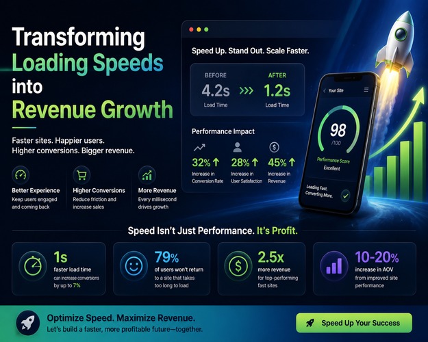
Mobile users expect pages to load instantly. Google research indicates that a mobile page load delay of just three seconds increases bounce probability by over 30 percent.
When a site drags, users close the tab and move to a competitor. Speed is a core part of design, not just a technical detail for developers to handle later.
Optimizing Visual Assets for Variable Network Conditions
Images often account for the bulk of a page's weight on mobile devices. You can deliver responsive images using modern formats like WebP or AVIF to cut file sizes without losing quality.
Implementing native lazy loading ensures that off-screen images do not load until the user scrolls down to them. Using a content delivery network places these assets closer to the user, which reduces round-trip times on cellular networks.
Minimizing JavaScript Execution and DOM Complexity
Heavy scripts paralyze lower-end mobile processors and cause frustrating layout shifts. Code splitting sends only the JavaScript needed for the current view.
Reducing third-party tags and keeping the Document Object Model clean helps the browser render pages faster. Prioritizing the critical rendering path ensures the main content appears on screen before background scripts finish running.
Leverage Contextual Features to Personalize the Mobile Experience
Tapping Into Device Capabilities for Seamless Interactions
Smartphones come with built-in hardware features that make interactions faster. You can integrate device geolocation for local store finders, one-tap mobile payments like Apple Pay, and camera access for barcode scanning.
These features remove manual data entry steps. Users complete tasks in seconds when they do not have to type out long addresses or credit card numbers.
Adapting Layouts to Dynamic Viewport Changes and Orientation
Mobile devices change size and orientation constantly. CSS Grid, Flexbox, and modern media queries help handle dynamic resizing, foldables, and landscape-to-portrait shifts smoothly.
Layouts should reflow without breaking text or hiding buttons when a user rotates their phone. Testing these state changes prevents awkward whitespace and overlapping elements.
Designing Adaptive Dark Mode and Contrast States
System-level dark mode support helps conserve battery life on OLED screens. It also reduces eye strain during nighttime mobile browsing sessions.
Your design system should include distinct color tokens for light and dark modes. This ensures text remains readable and buttons stand out regardless of the user's system settings.
Measure Mobile Engagement Through Advanced Analytics and Testing
Moving Beyond Basic Traffic Metrics to Track Micro-Conversions
Page views and bounce rates only tell part of the story. You can measure specific mobile engagement signals, such as scroll depth, tap heatmaps, and micro-interactions, using tools like Hotjar or Google Analytics 4.
These insights show where users get stuck or ignore important content. Tracking micro-conversions helps you spot usability issues before they hurt overall sales.
Conducting Real-Device Usability Testing Across Ecosystems
Browser emulators do not always catch rendering bugs or touch latency issues. You need to test responsive layouts on a fragmented matrix of iOS and Android devices.
Physical testing reveals how real hardware handles your animations and CSS rules. Small screen sizes and varied processor speeds expose flaws that desktop tests miss entirely.
Iterating Based on Real-User Feedback and Performance Data
Continuous A/B testing helps you find the best layout variations for your audience. You can test mobile-specific font sizes, button placements, and form lengths to see what drives higher interaction rates.
Base your changes on hard data rather than guesswork. Small adjustments to touch targets or spacing can yield large gains in conversion rates over time.
Conclusion
Maximizing mobile engagement requires a change in how digital products are built and tested. Treating the smartphone screen as the primary design constraint creates intuitive and fast experiences. You can improve results by prioritizing core content, removing friction, optimizing for speed, and refining interfaces through real-device data. Responsive first-class design drives modern digital retention and growth.